
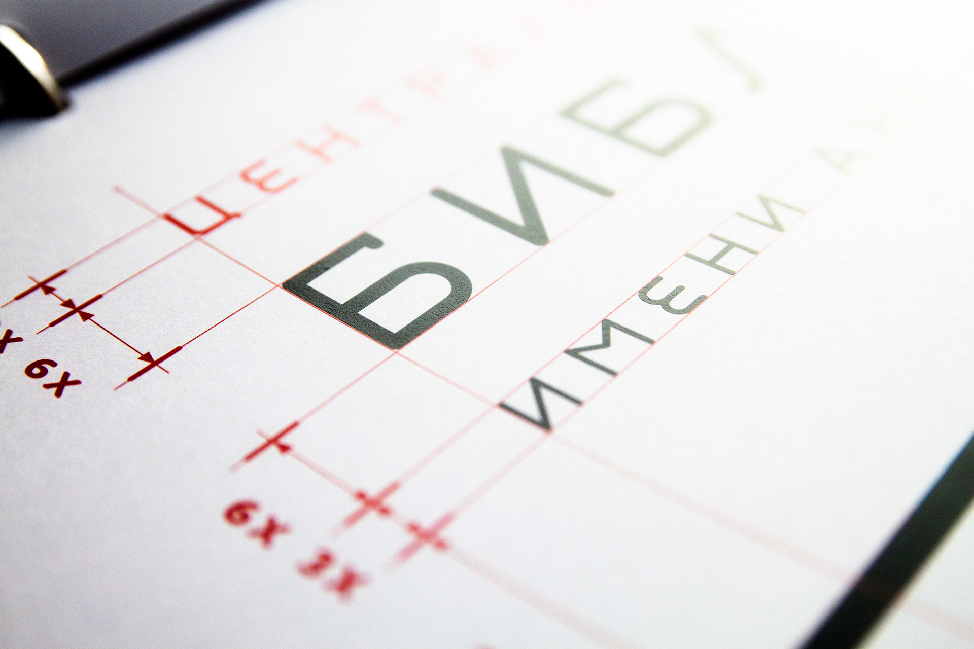
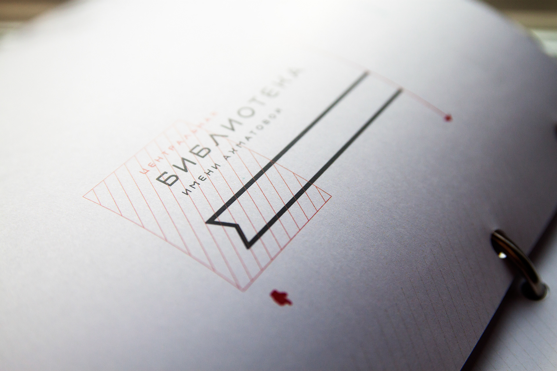
Library is a place where information is stored, usually in the form of a book. This is why book is widely used as the main and/or only part of library’s logo. However, with the proliferation of the internet and the development of the alternative forms and sources
of information this symbol becomes less relevant. Therefore, we propose a symbol
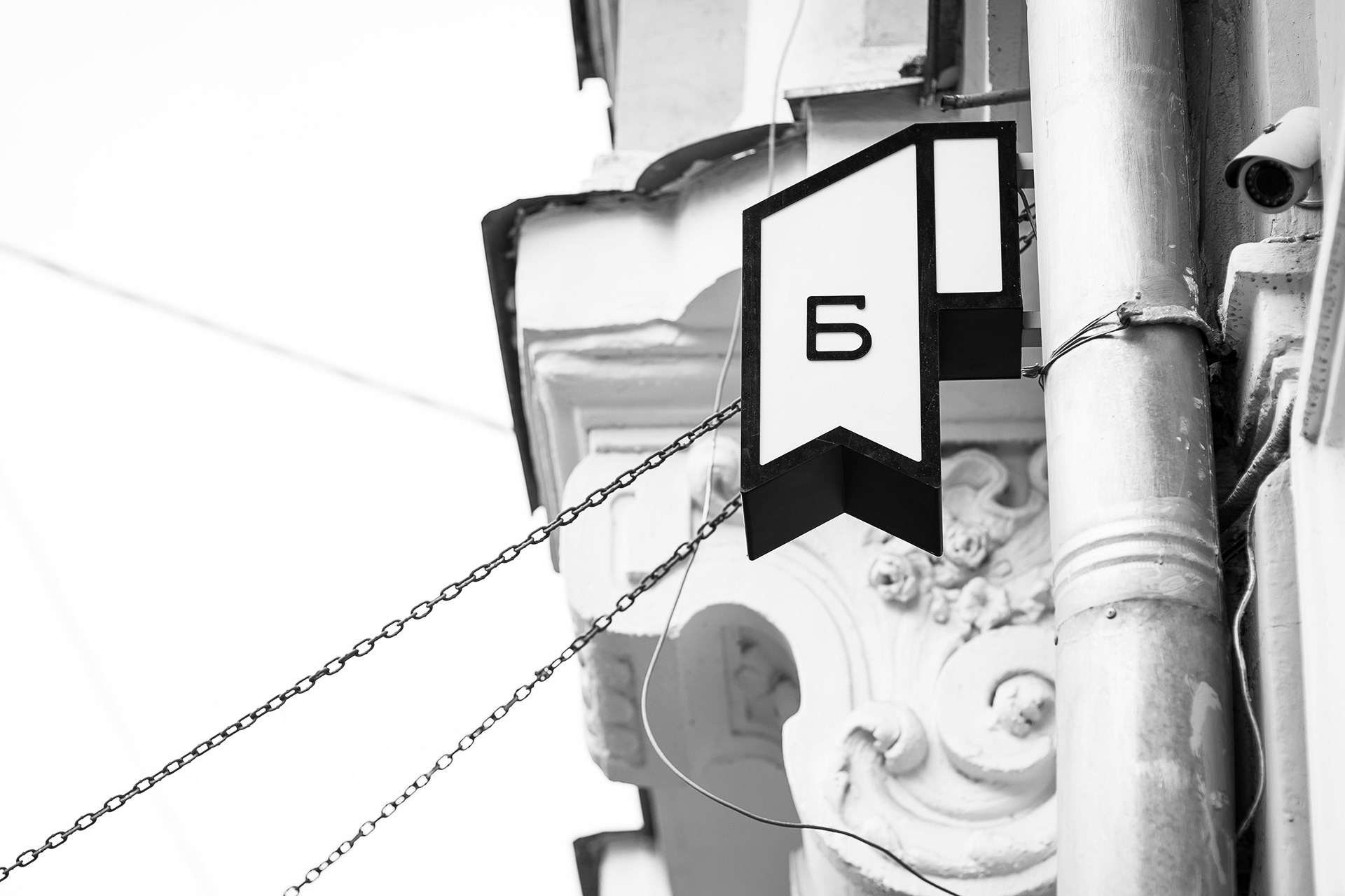
of a «Bookmark» as an alternative to be used as a symbol and part of the logo
of a modern library.
of information this symbol becomes less relevant. Therefore, we propose a symbol
of a «Bookmark» as an alternative to be used as a symbol and part of the logo
of a modern library.
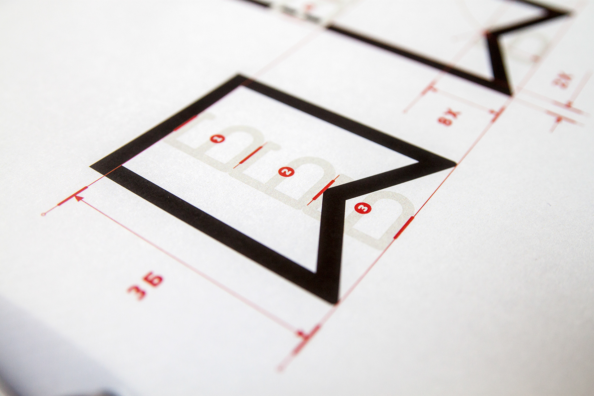
main mark

alternative mark
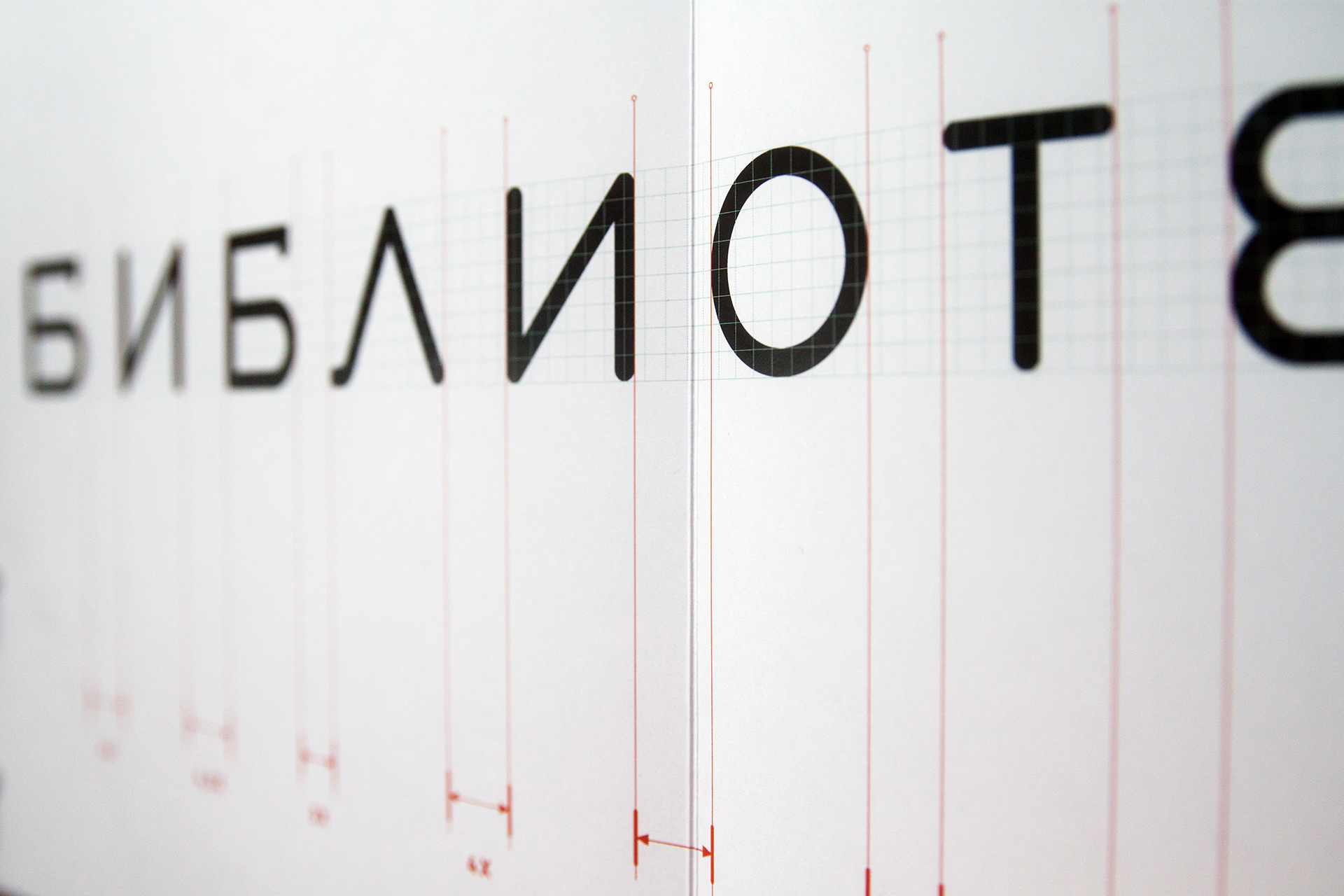
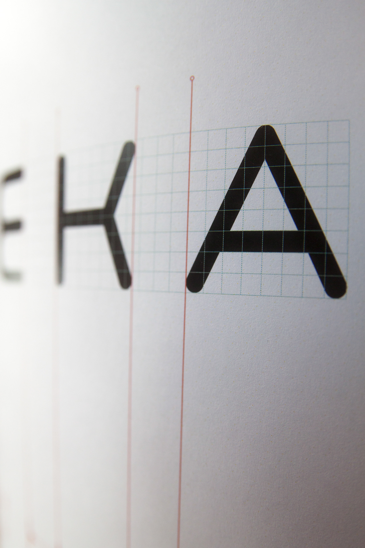
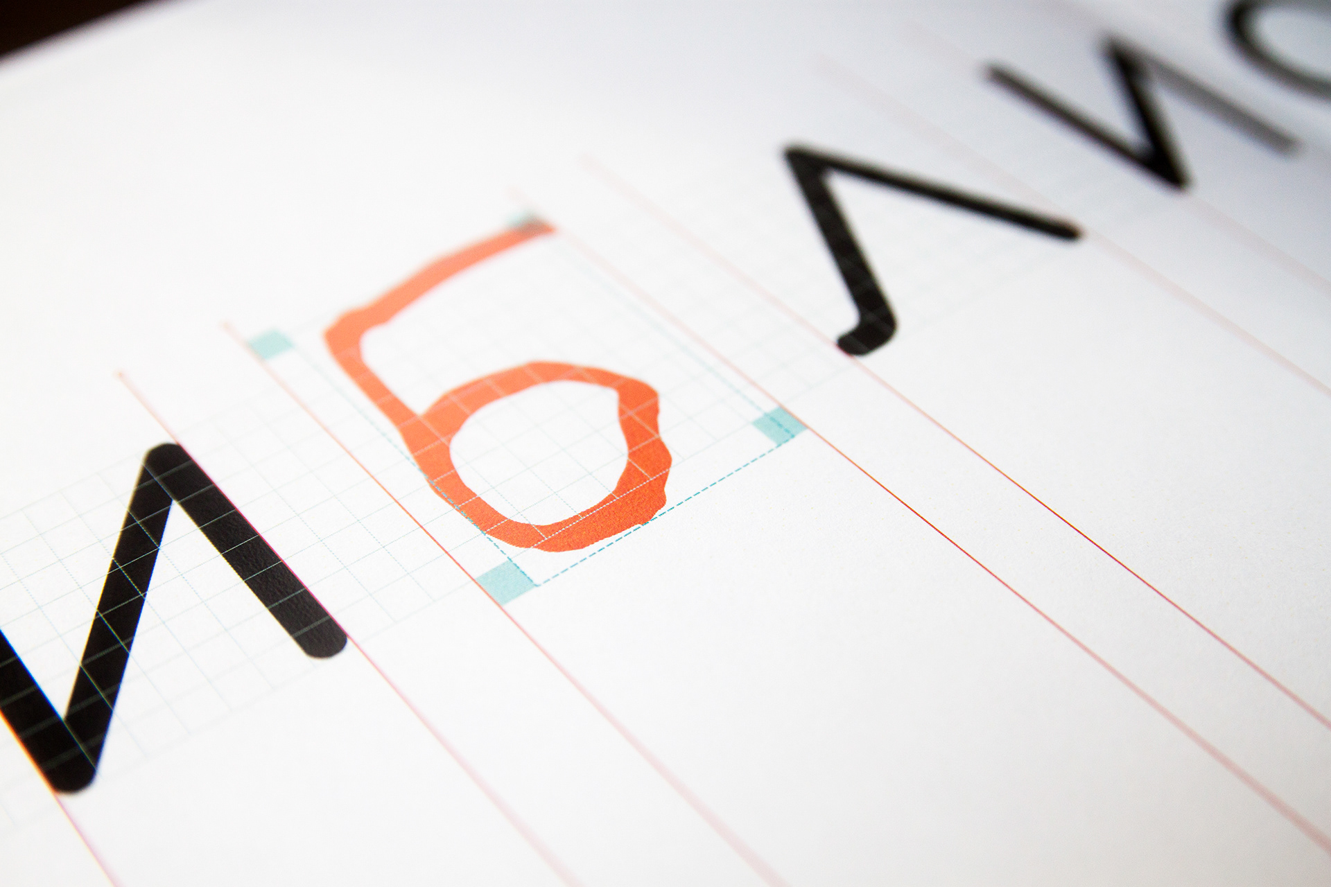
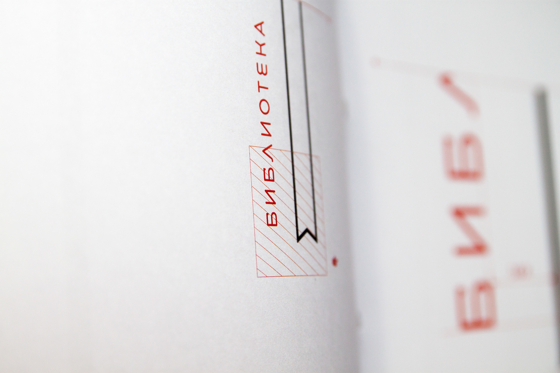
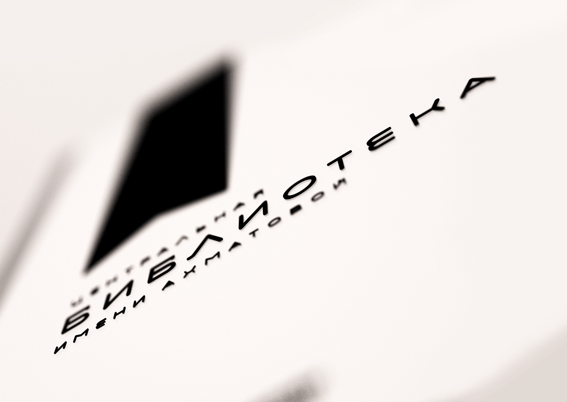
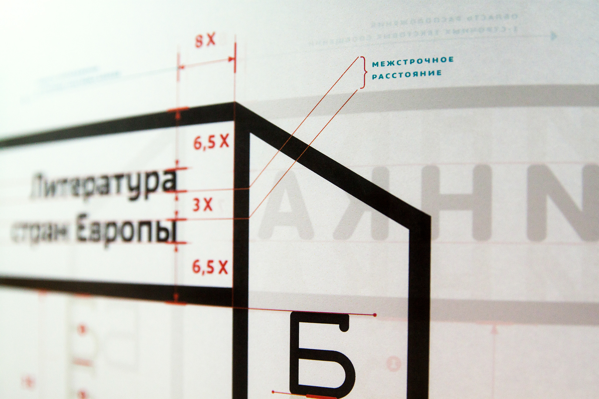
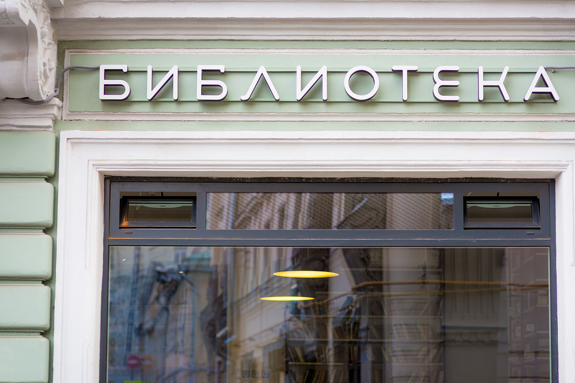
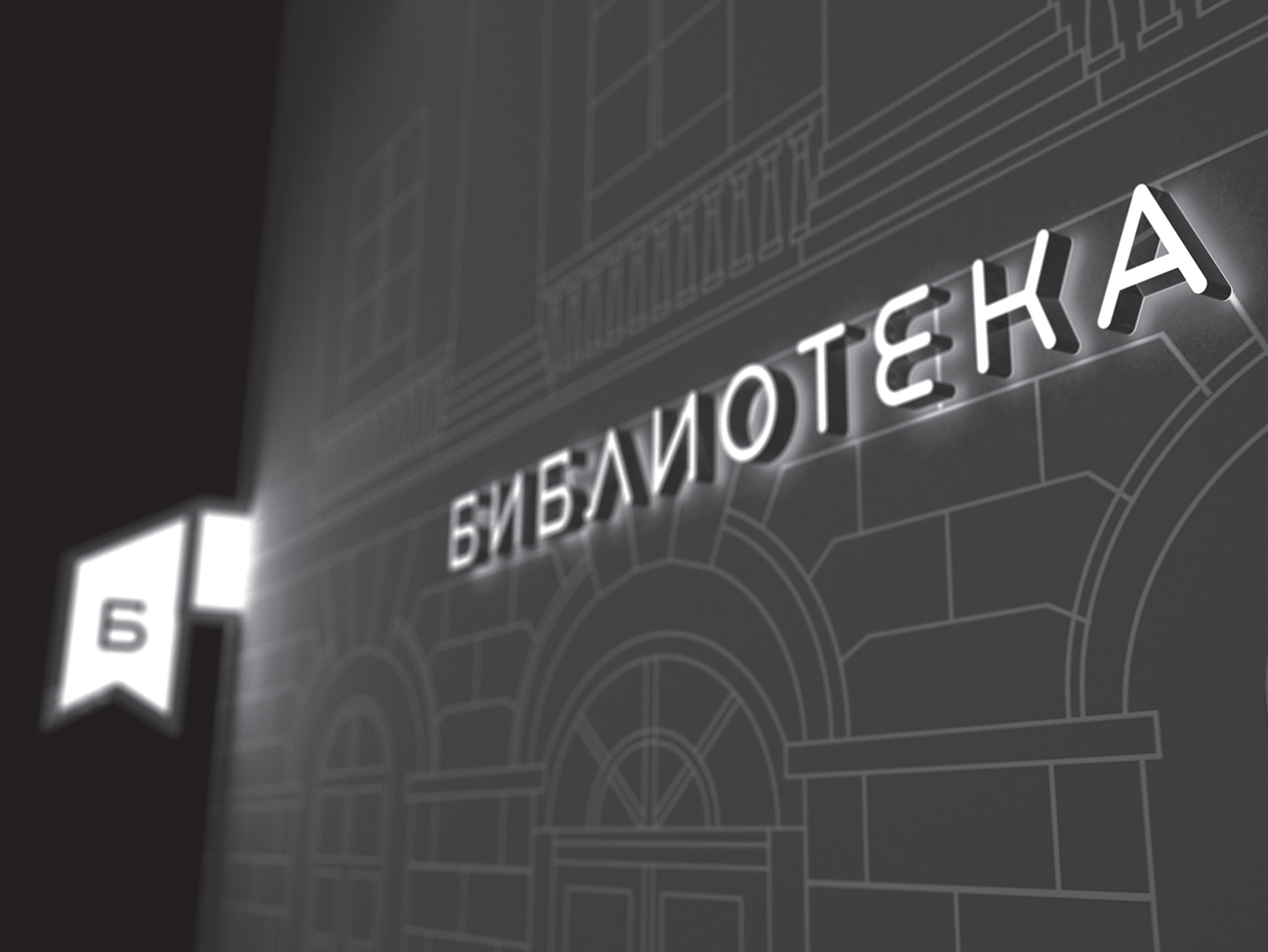
THE WORDMARK

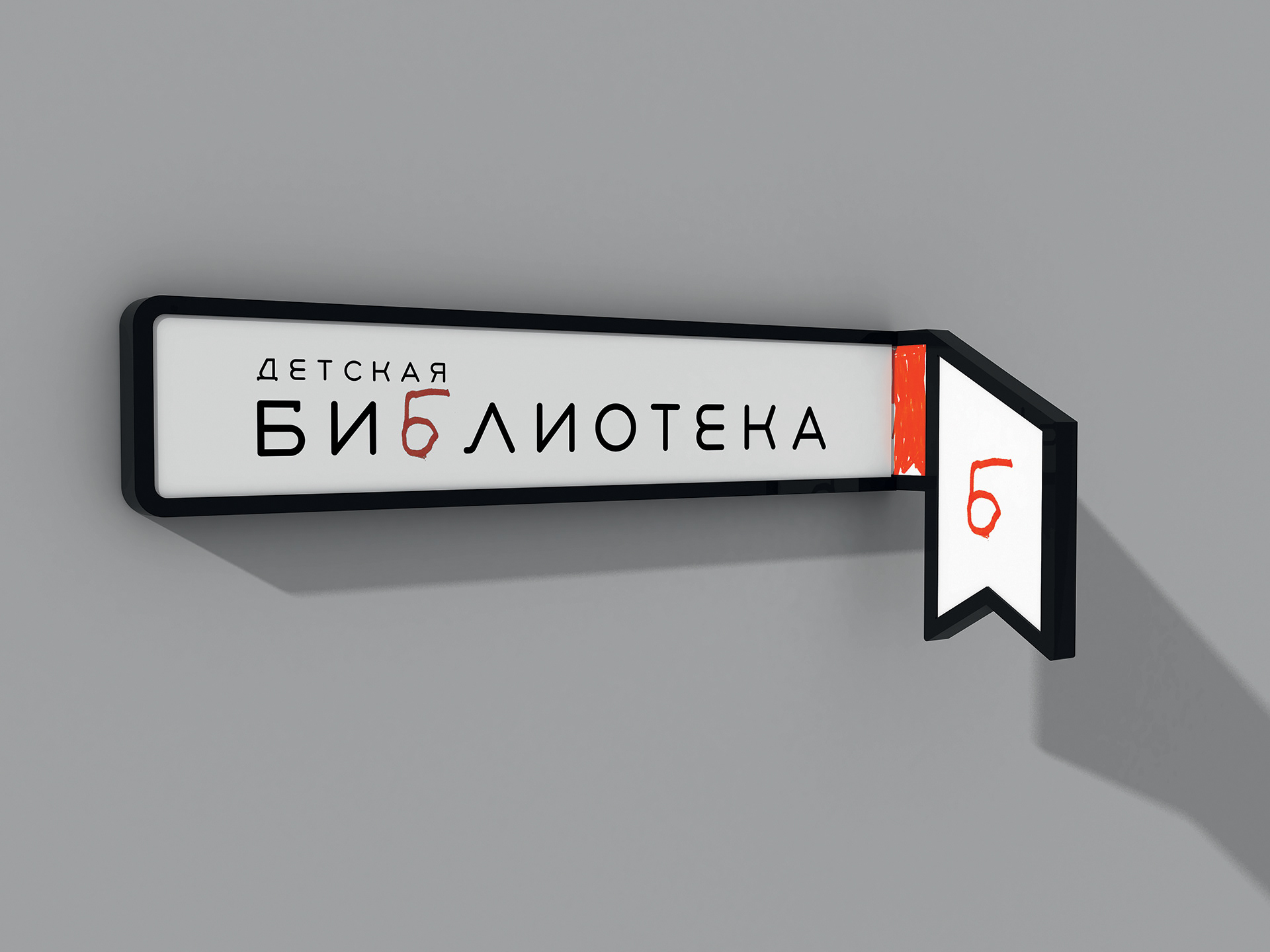
THE WORDMARK EXTENDED OPTION ( KID'S LIBRARY )
THE COMPOSED LOGOTYPE
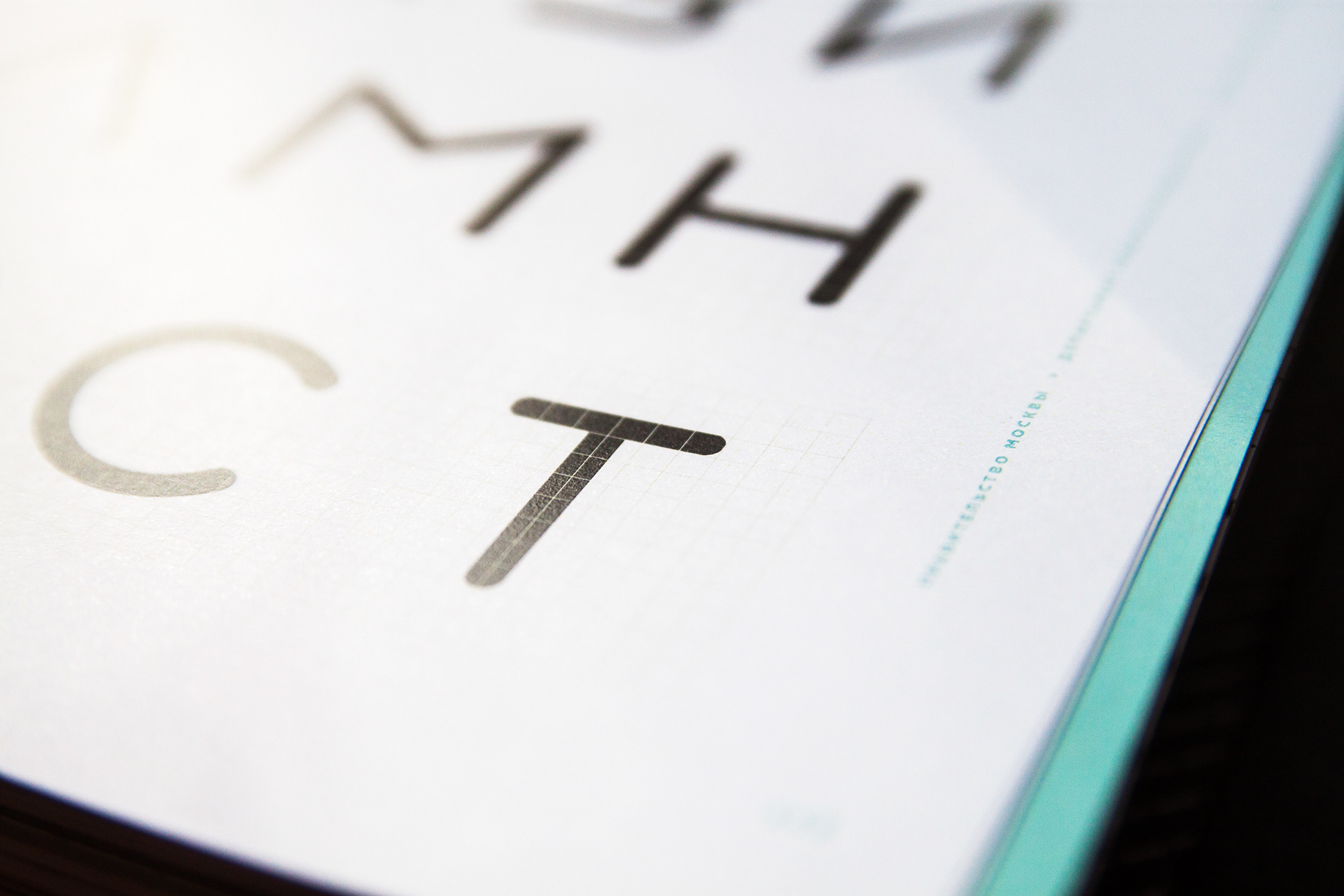
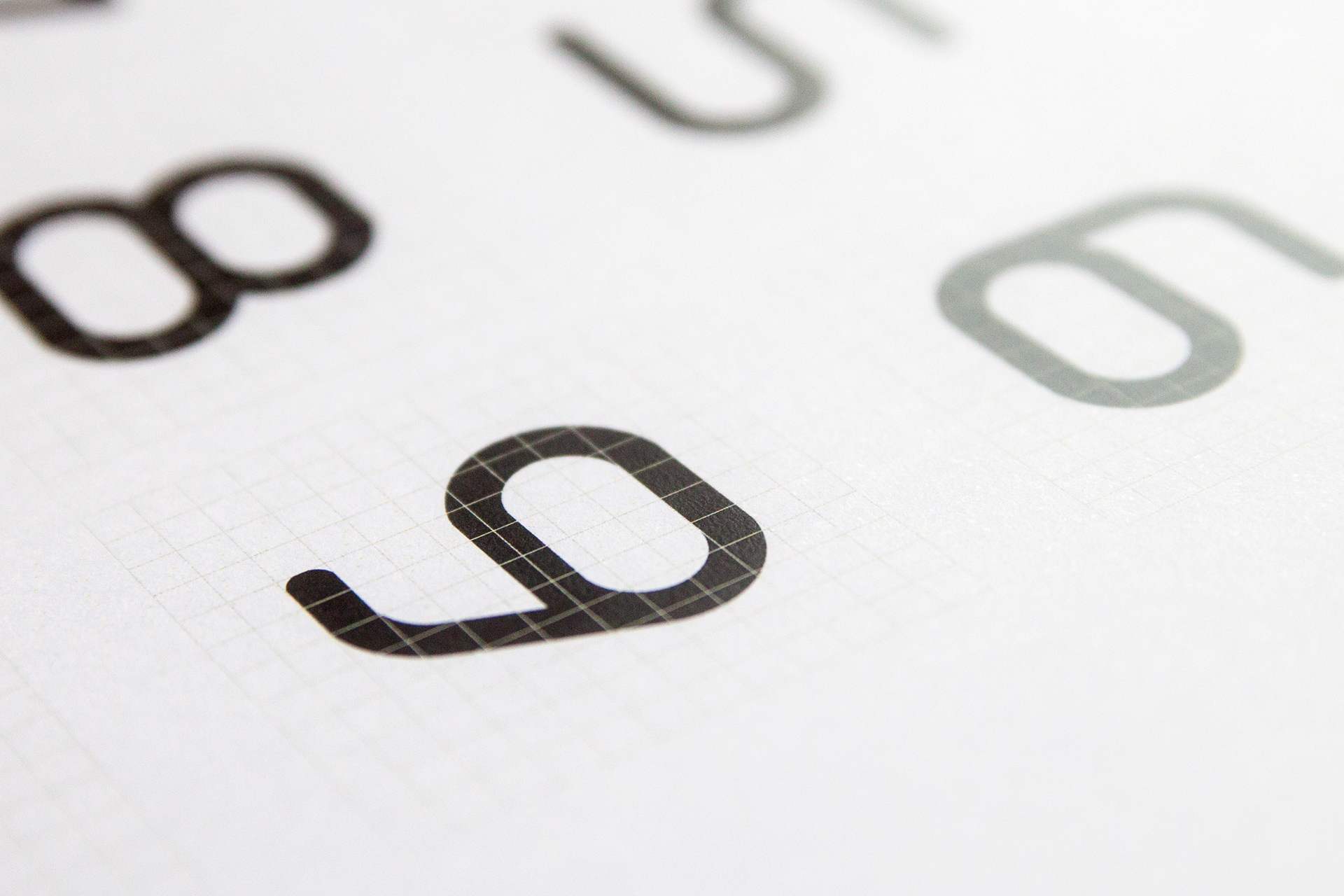
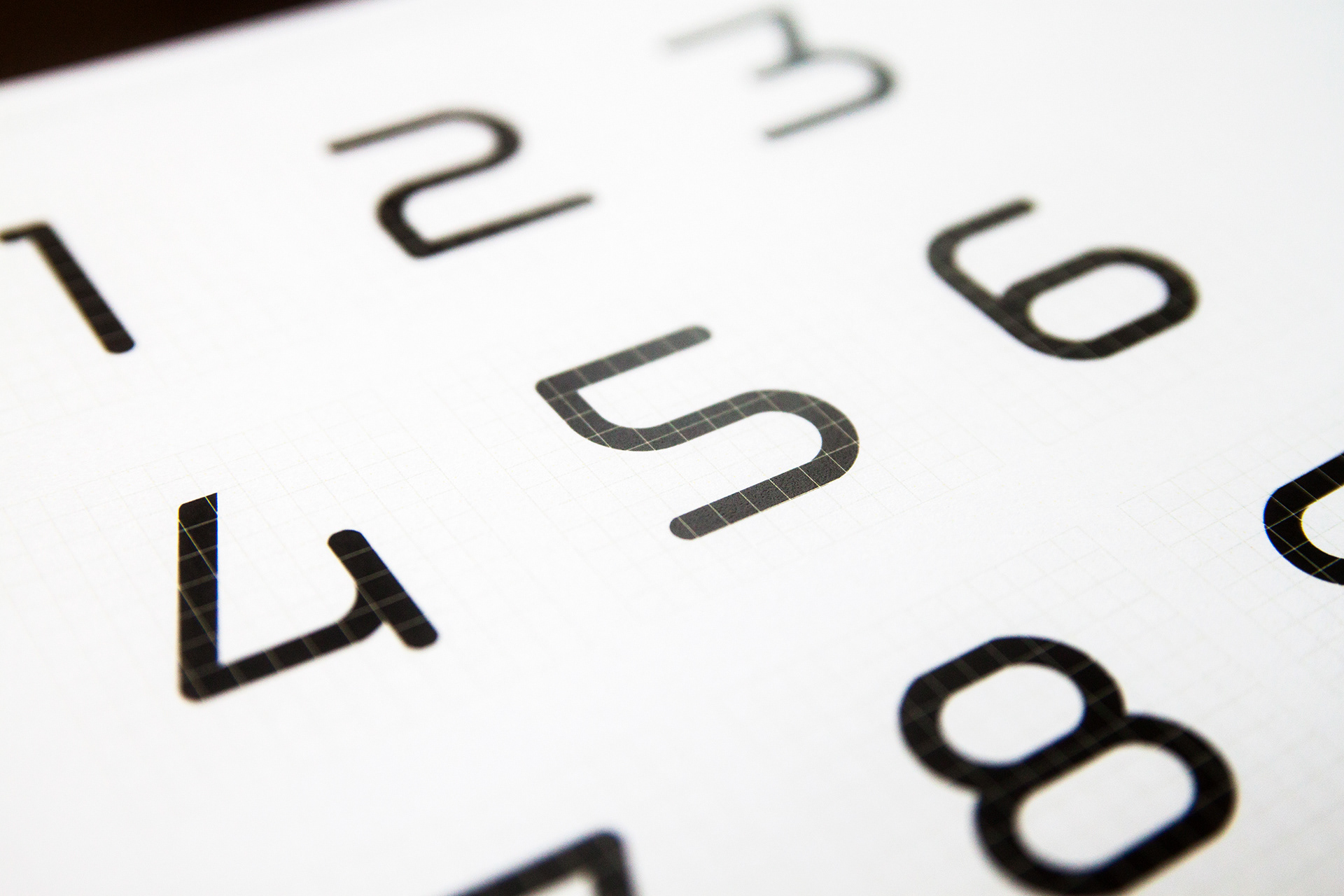
THE DISPLAY FONT

THE SECONDARY GRAPHICS
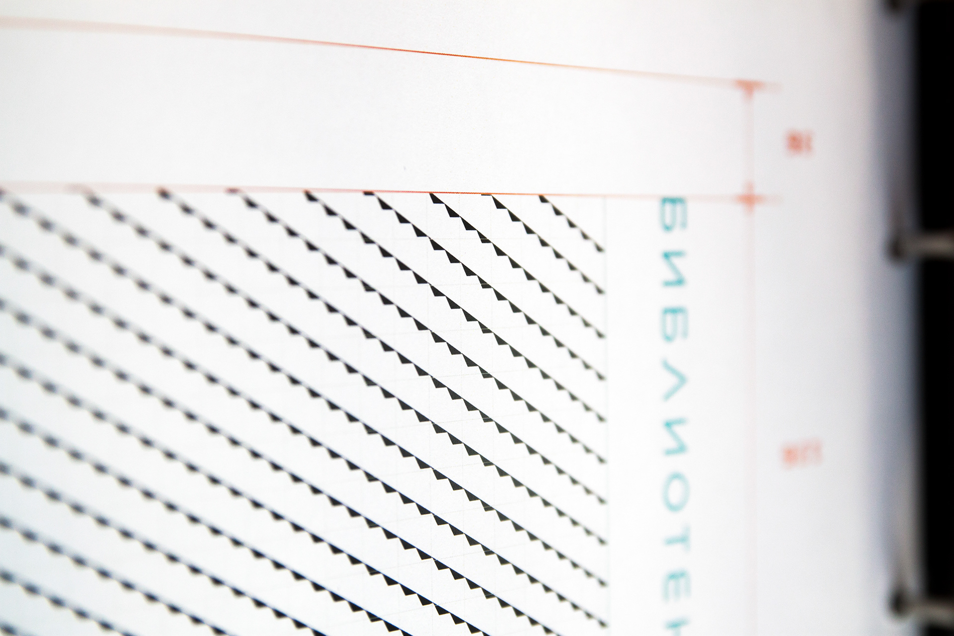
The auxiliary graphic is patterns which are created of monochrome symbols - allusions to reading and books.
A number of examples of patterns and its elements are presented in this chapter. However, a designer is not limited in his or her decisions on the content and complexity of a pattern, which is subject to artistic creativity and skills only.

Version A
This element of a pattern is a graphic representation of weaving of a fabric which a bookmark is made of. The use of this pattern allows one to create a grid which can lately be used, adapted to various information displays.

Version B
A shadow cast by an open book was taken as the basis of the pattern. This image is easily interpreted
and makes an easy and appealing graphic element.
and makes an easy and appealing graphic element.
Example of secondary graphic in use. A notifcation sticker on a glass door.

Example of secondary graphic in use. A notifcation sticker on a glass door.
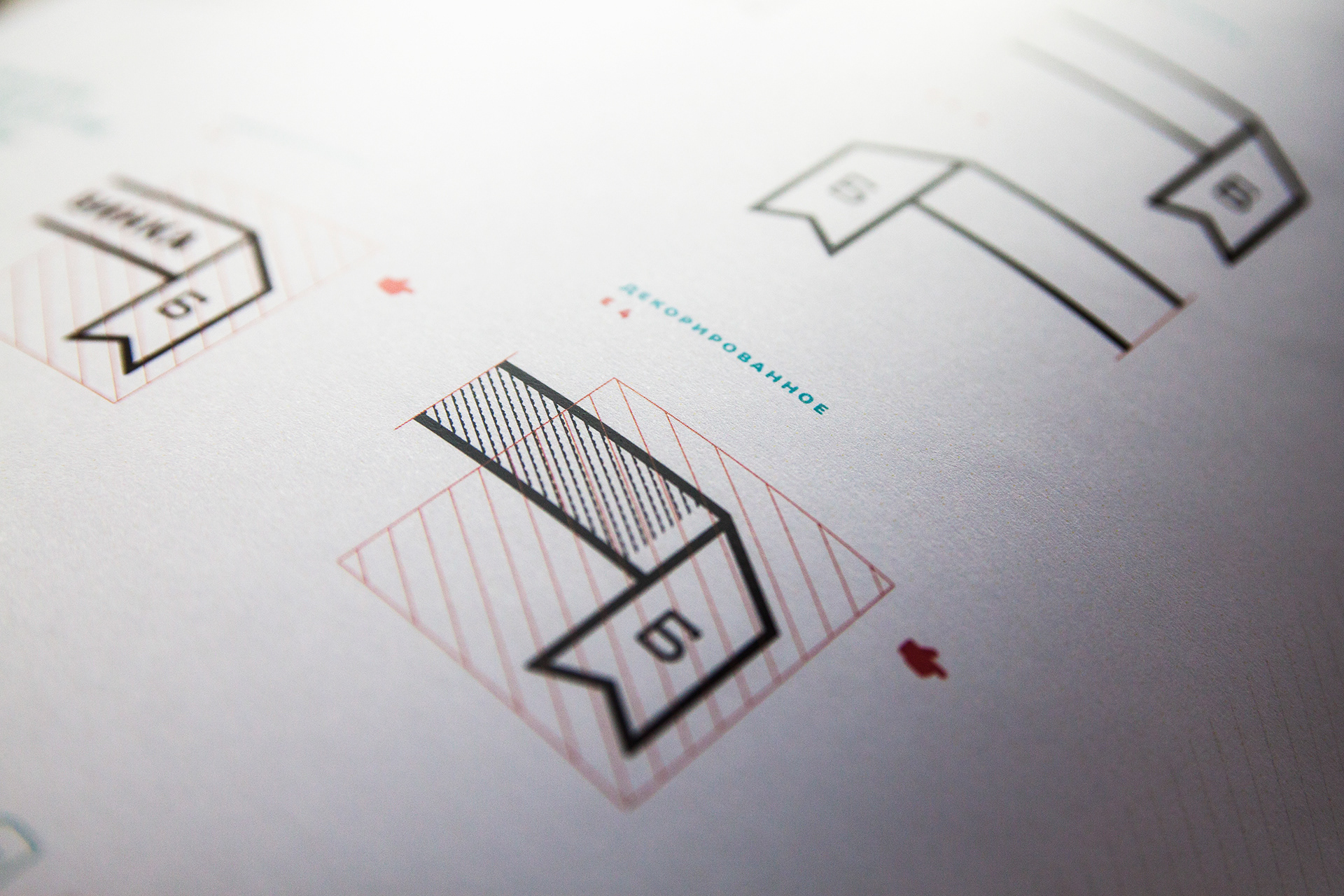
Option C
A widespread way of identifying the last read page, the folded corner of a page, was taken as a basis for this element.


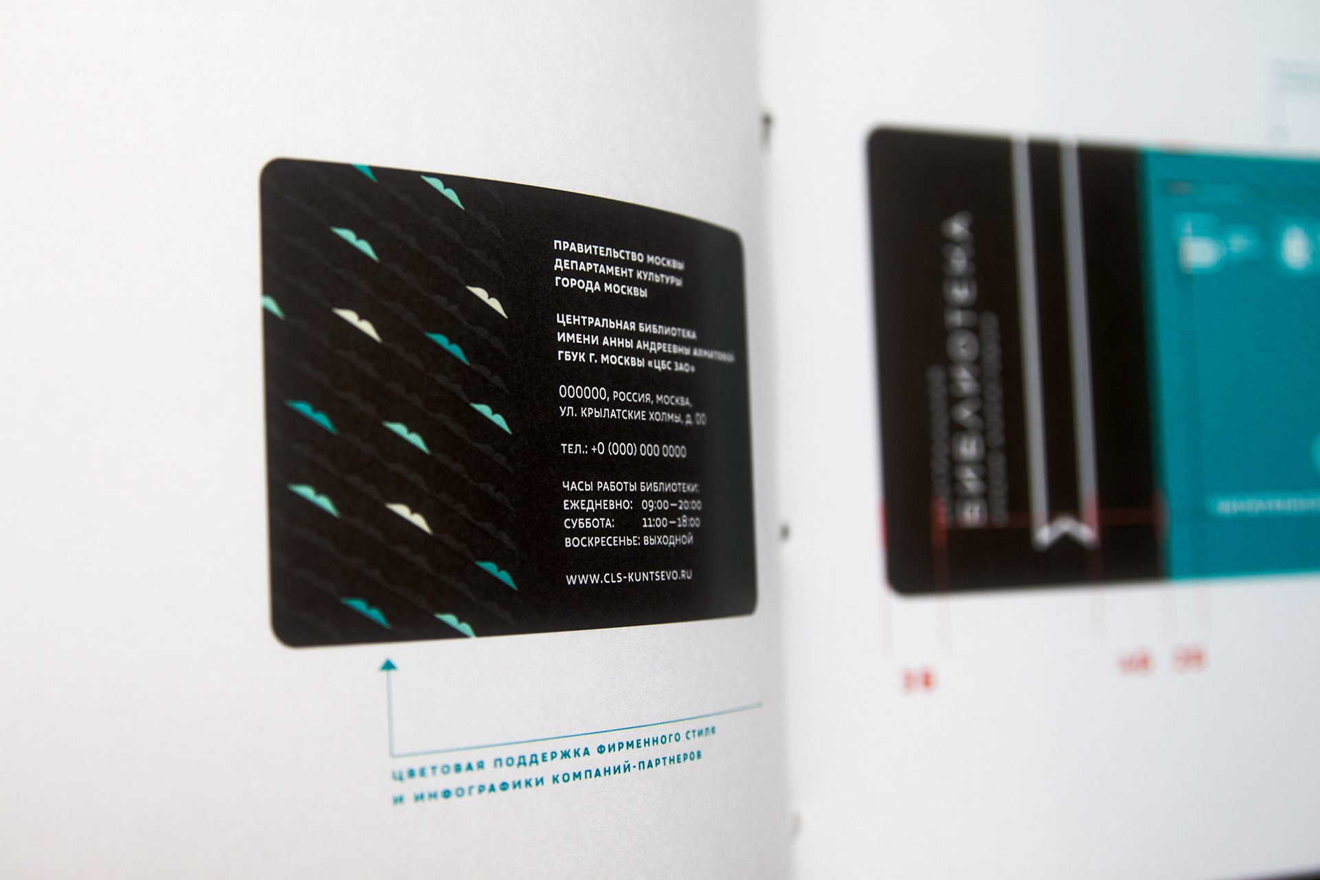
Member personalized card.
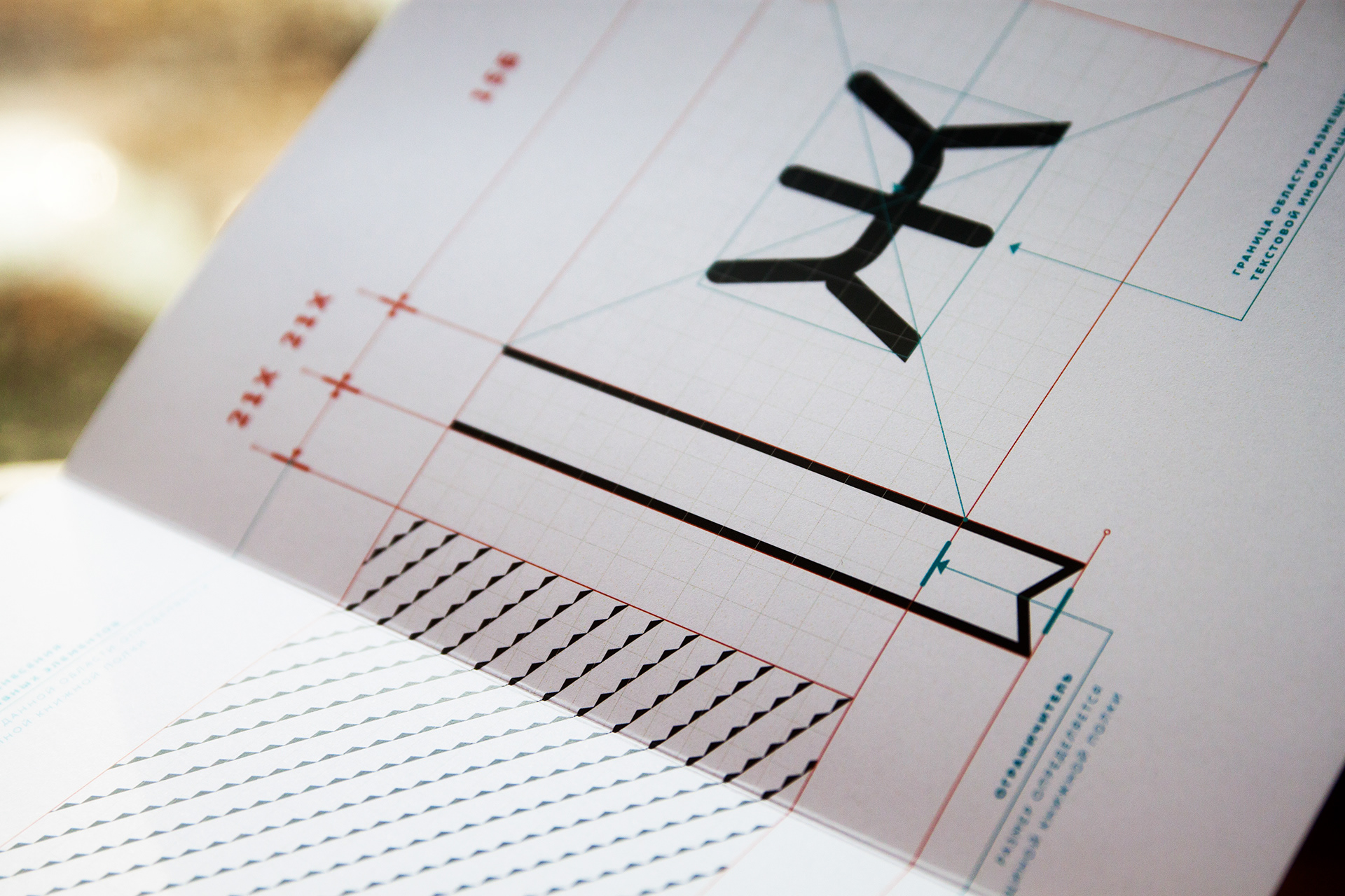
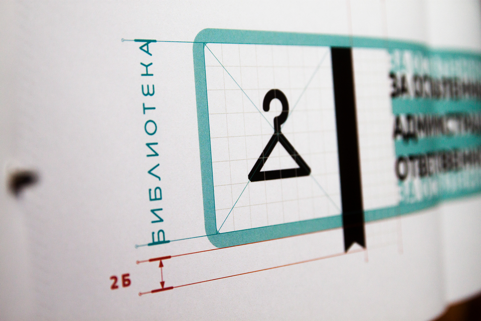
Construction

Prototype
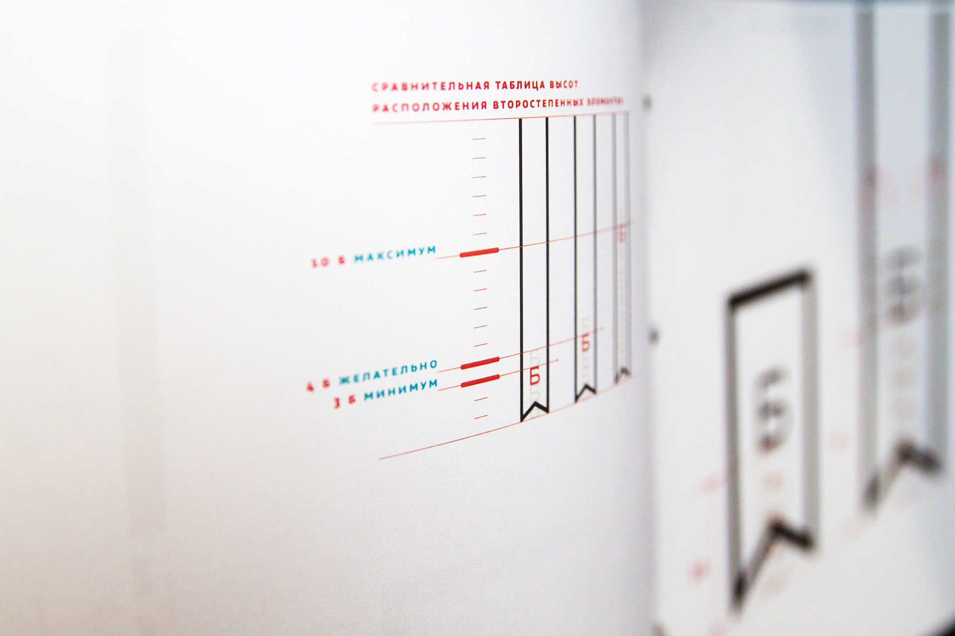
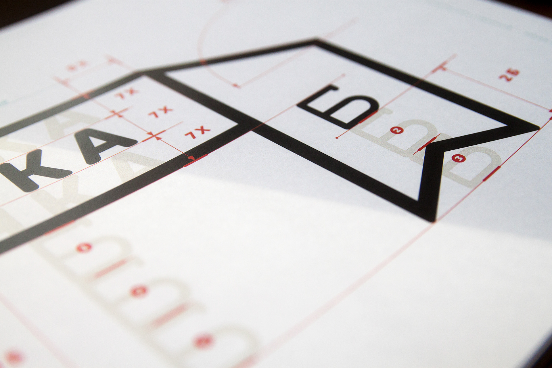
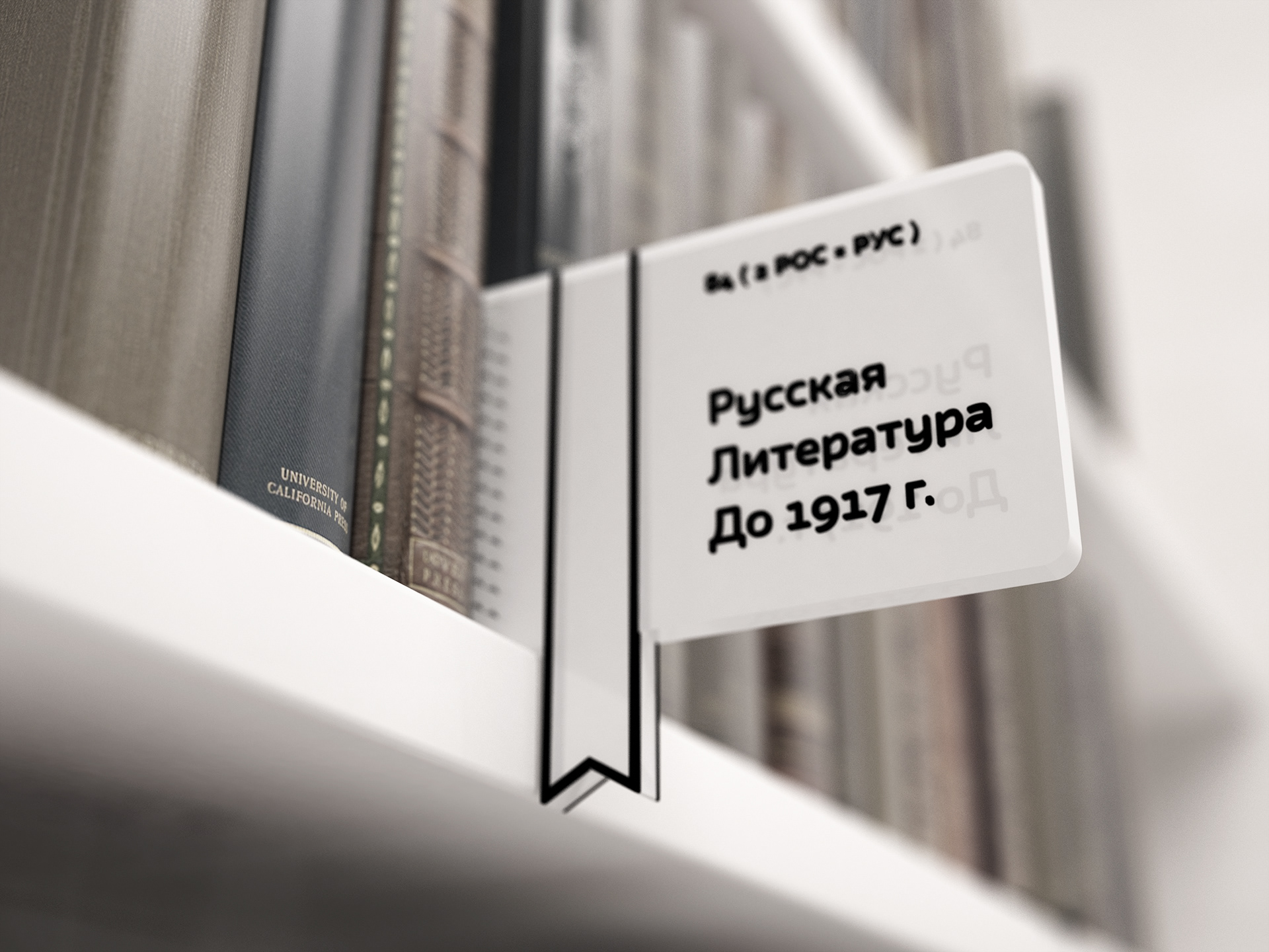
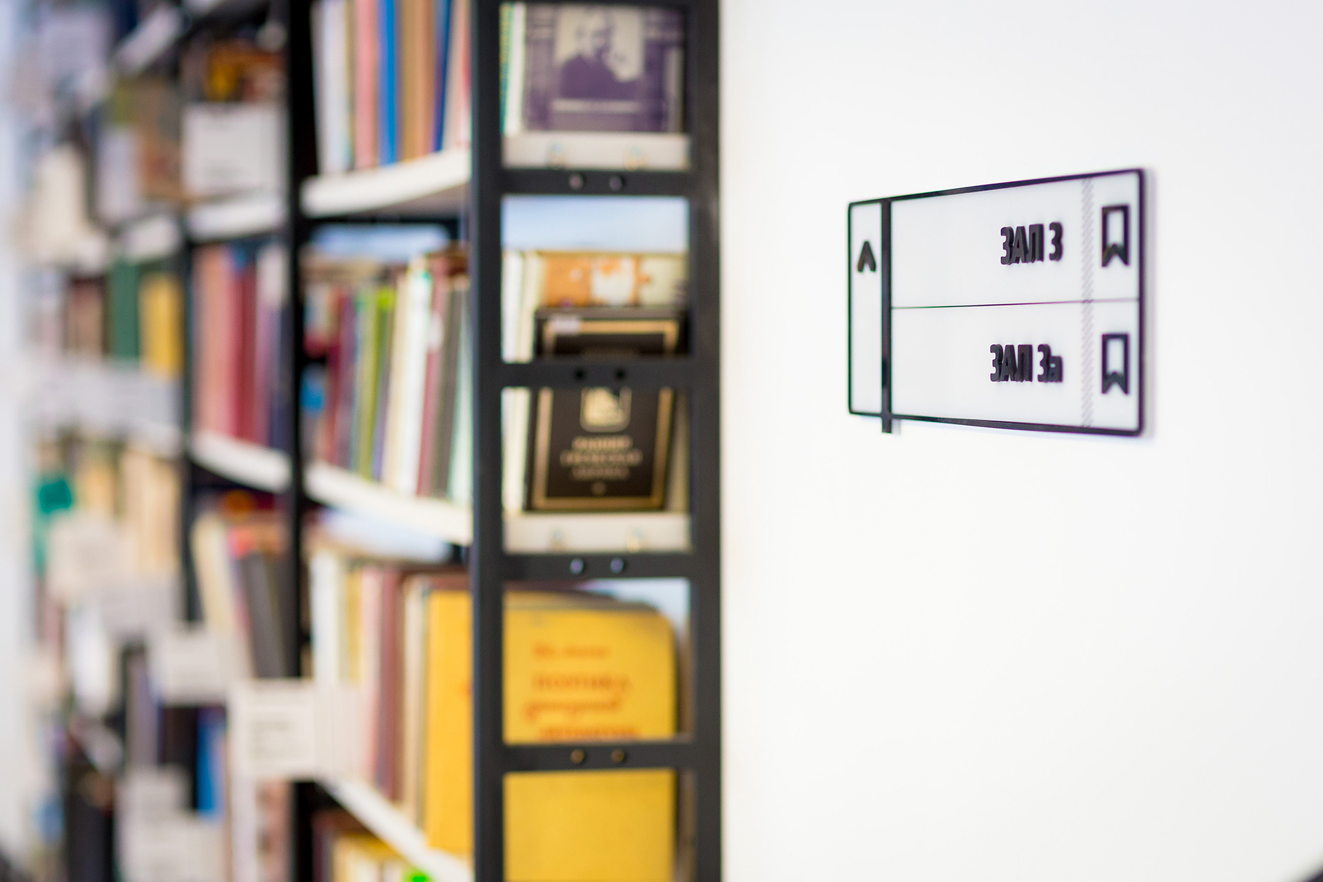
BOOK SHELF ALPHABETIC NAVIGATION SIGNS
Construction. Example of secondary graphic usage.

BOOK SHELF THEME NAVIGATION SIGNS
Prototype
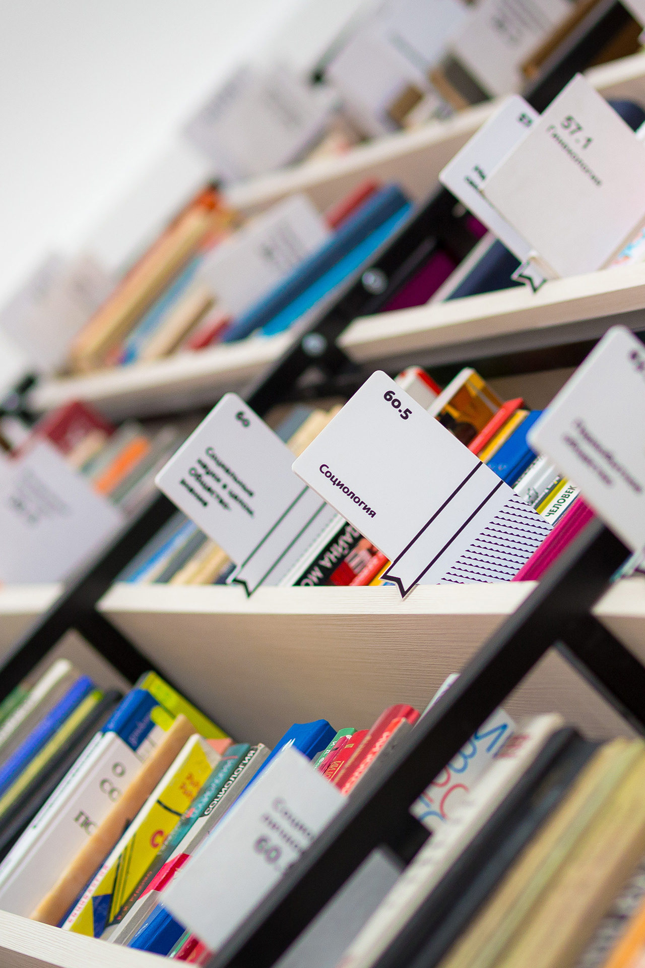
Bookshelf signs in use.
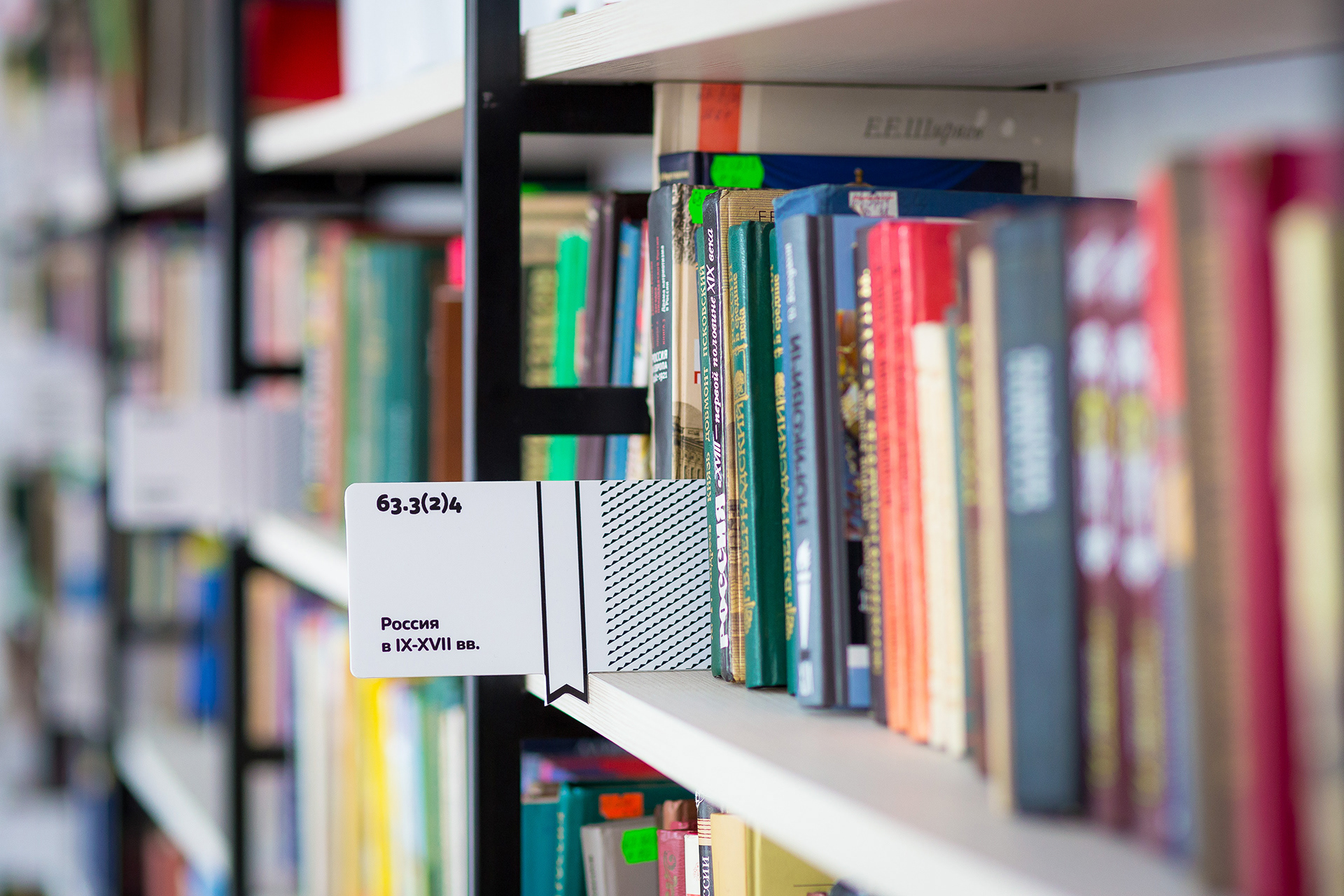
Bookshelf signs in use.
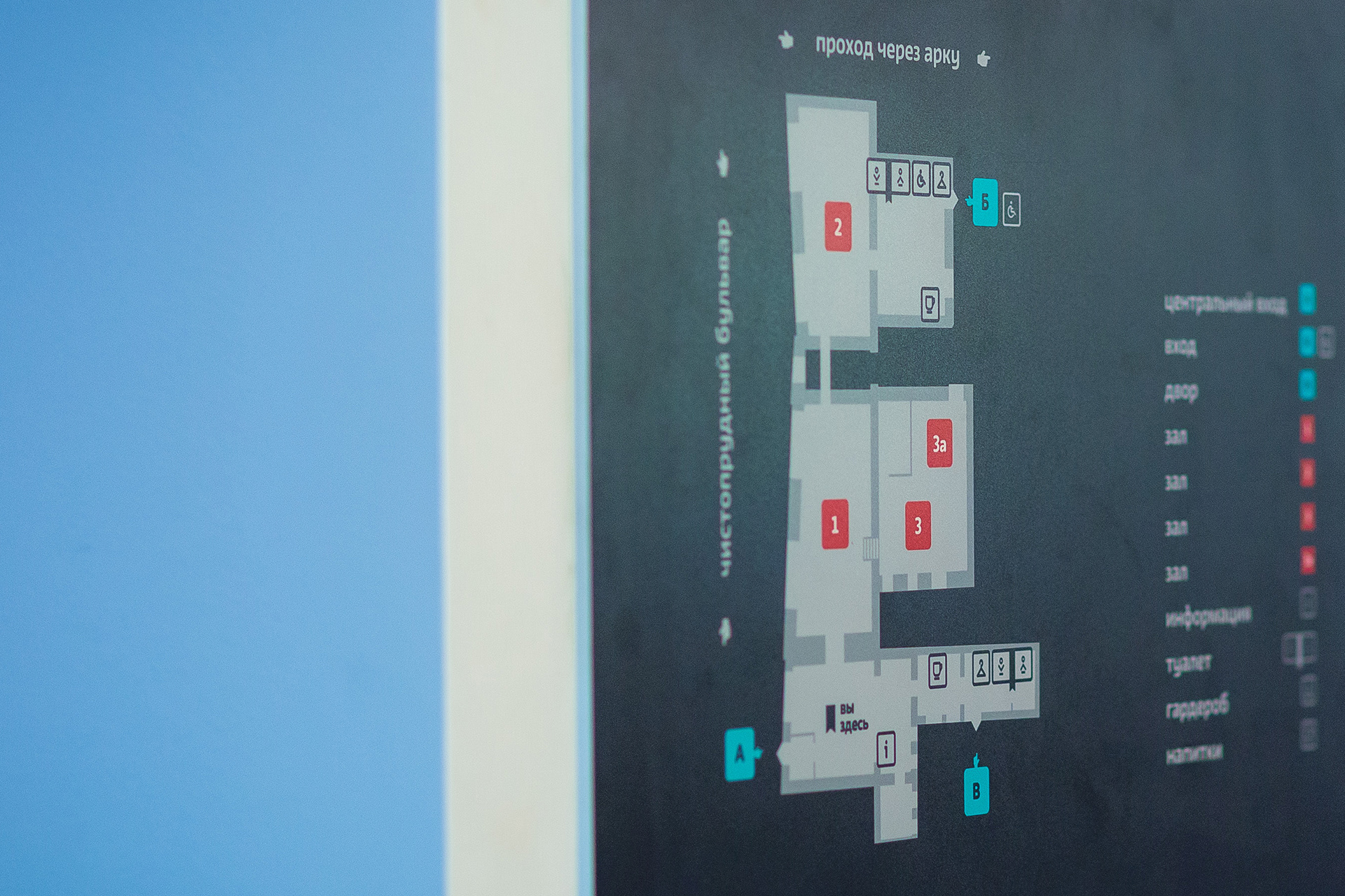
MAIN INTERIOR INFORMATION SIGNS

Reception
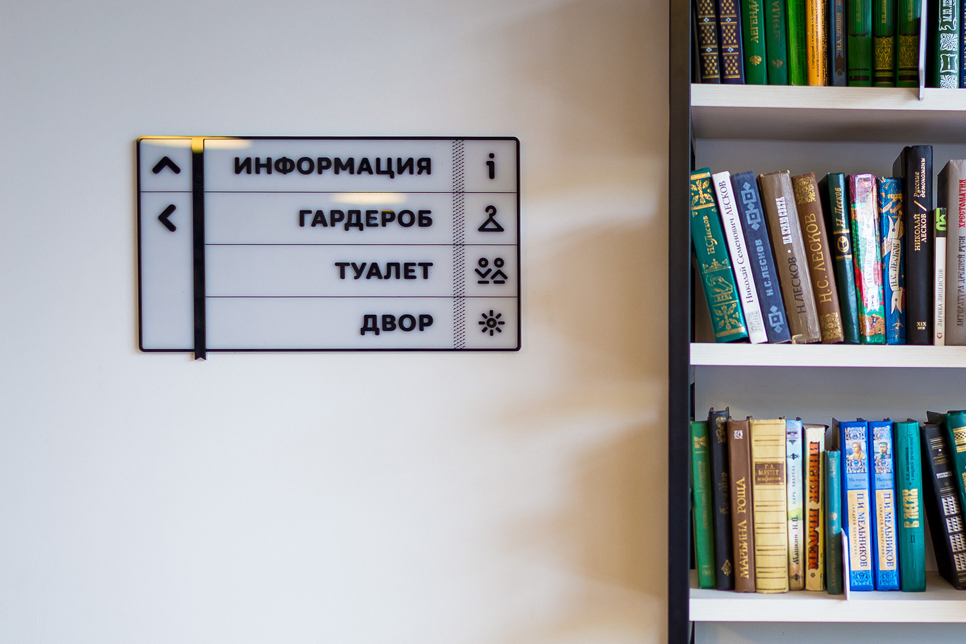
Indoor signage plate in use.
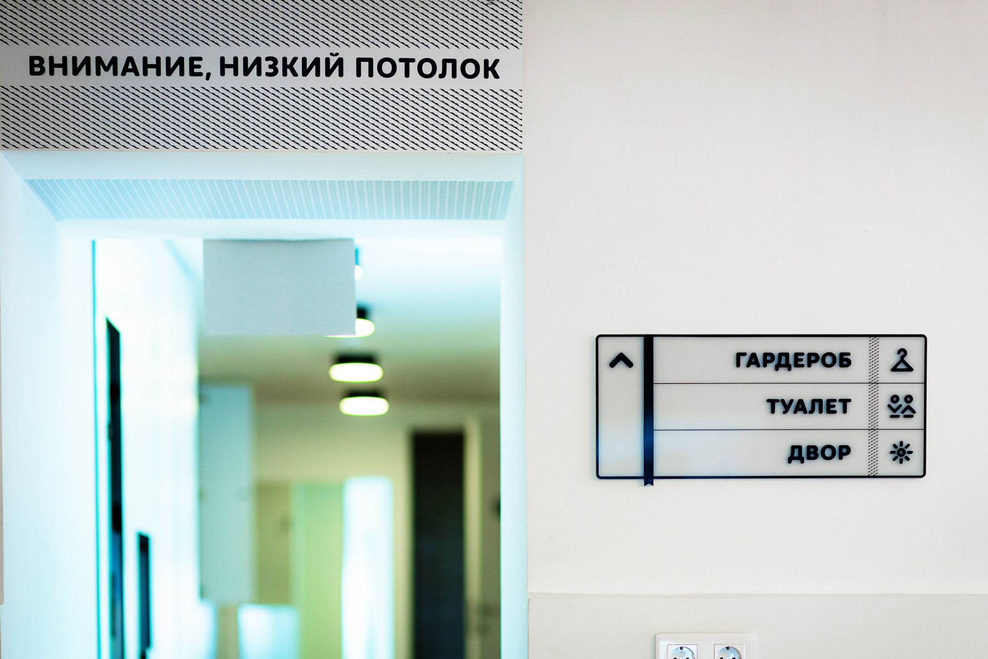
Wall attention graphics and signage plate.


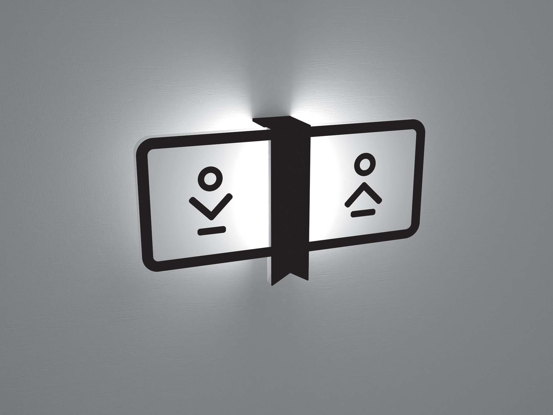
The rest room lit sign.

ICONOGRAPHY

EXTERIOR NAVIGATION ELEMENTS
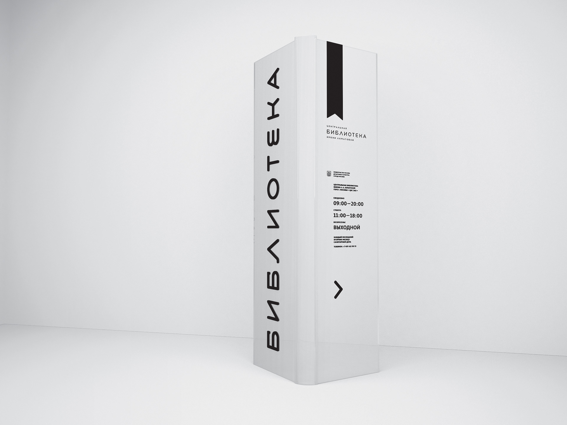
OUTDOOR INFORMATION POLE | A

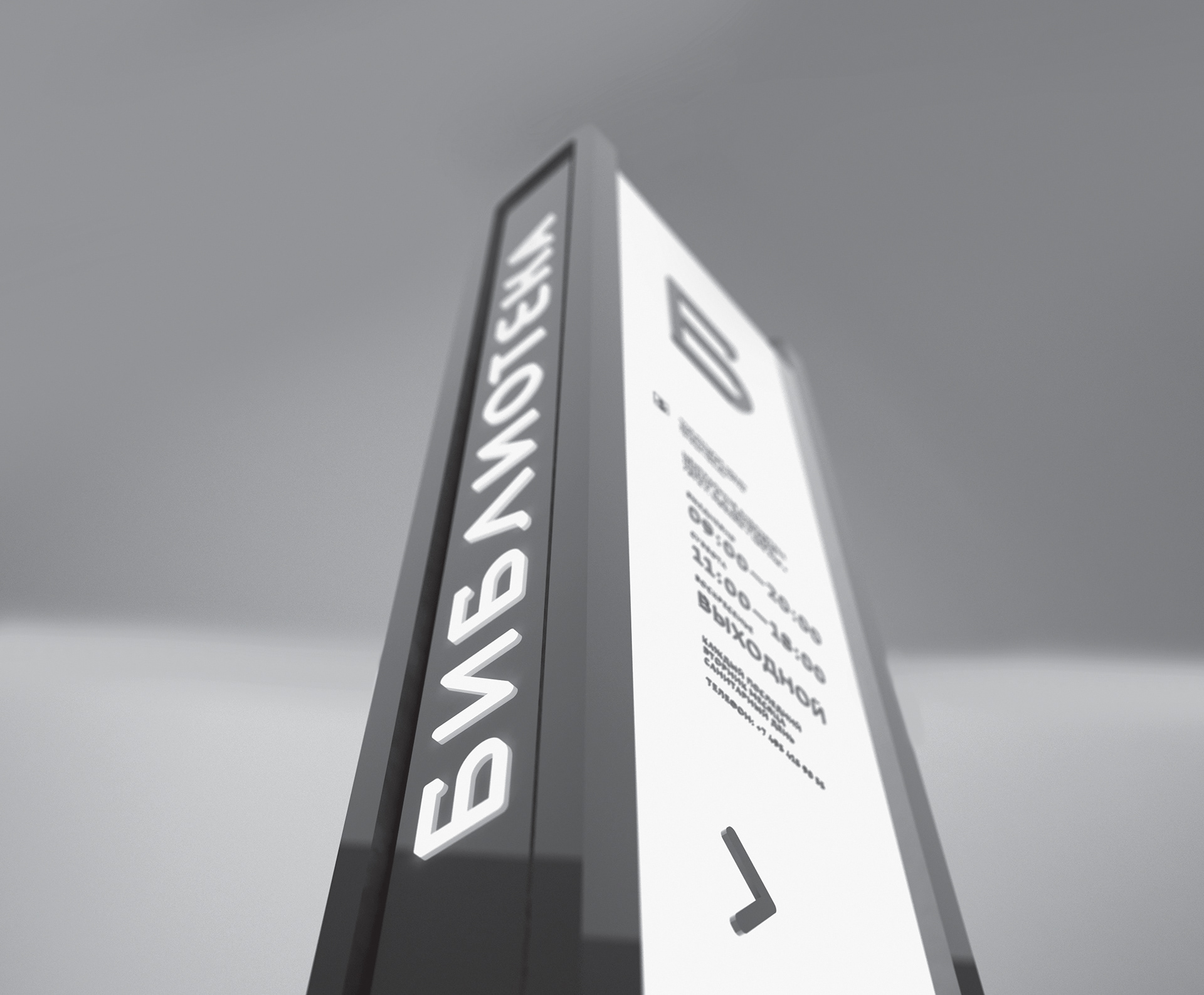

OUTDOOR INFORMATION POLE | B
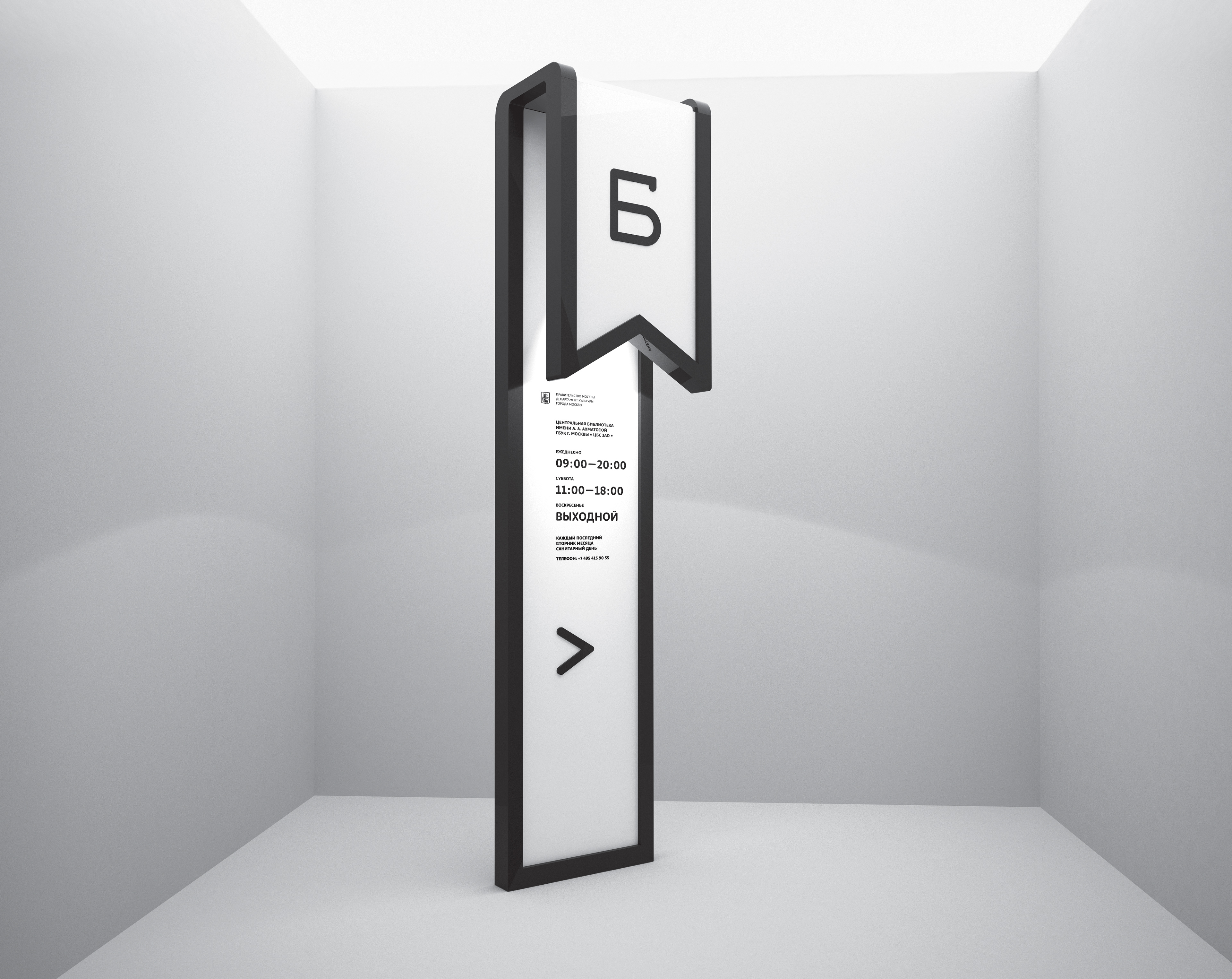


OUTDOOR INFORMATION POLE | C

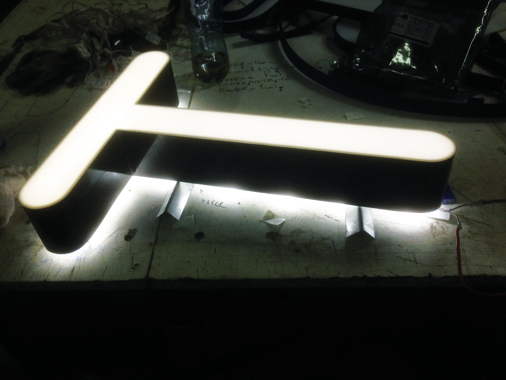
ENTRANCE SIGNAGE

Outdoor entrance signage. Wordmark in use.
Outdoor entrance set. Prototype.

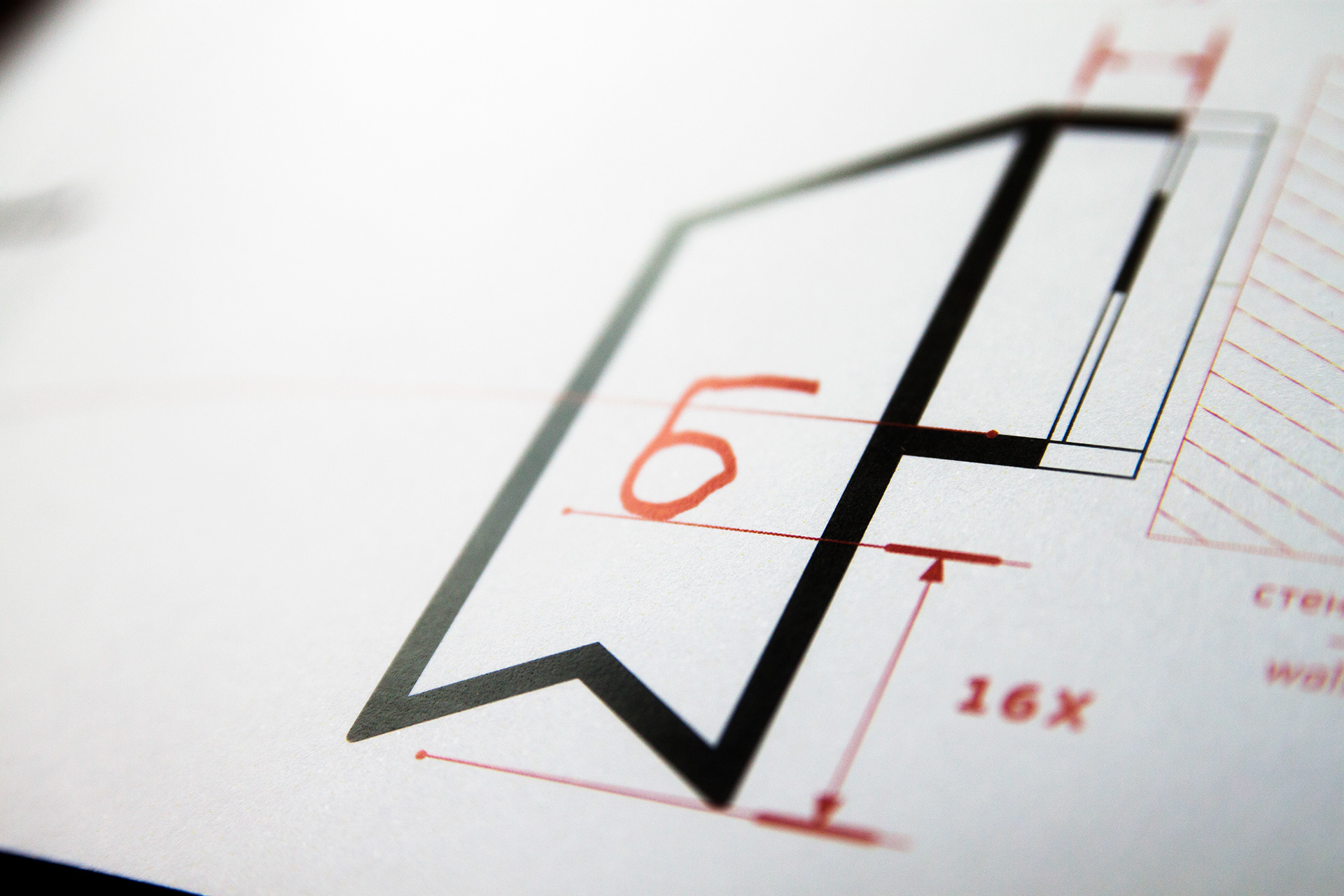
Two line entrance signage. Blueprint.

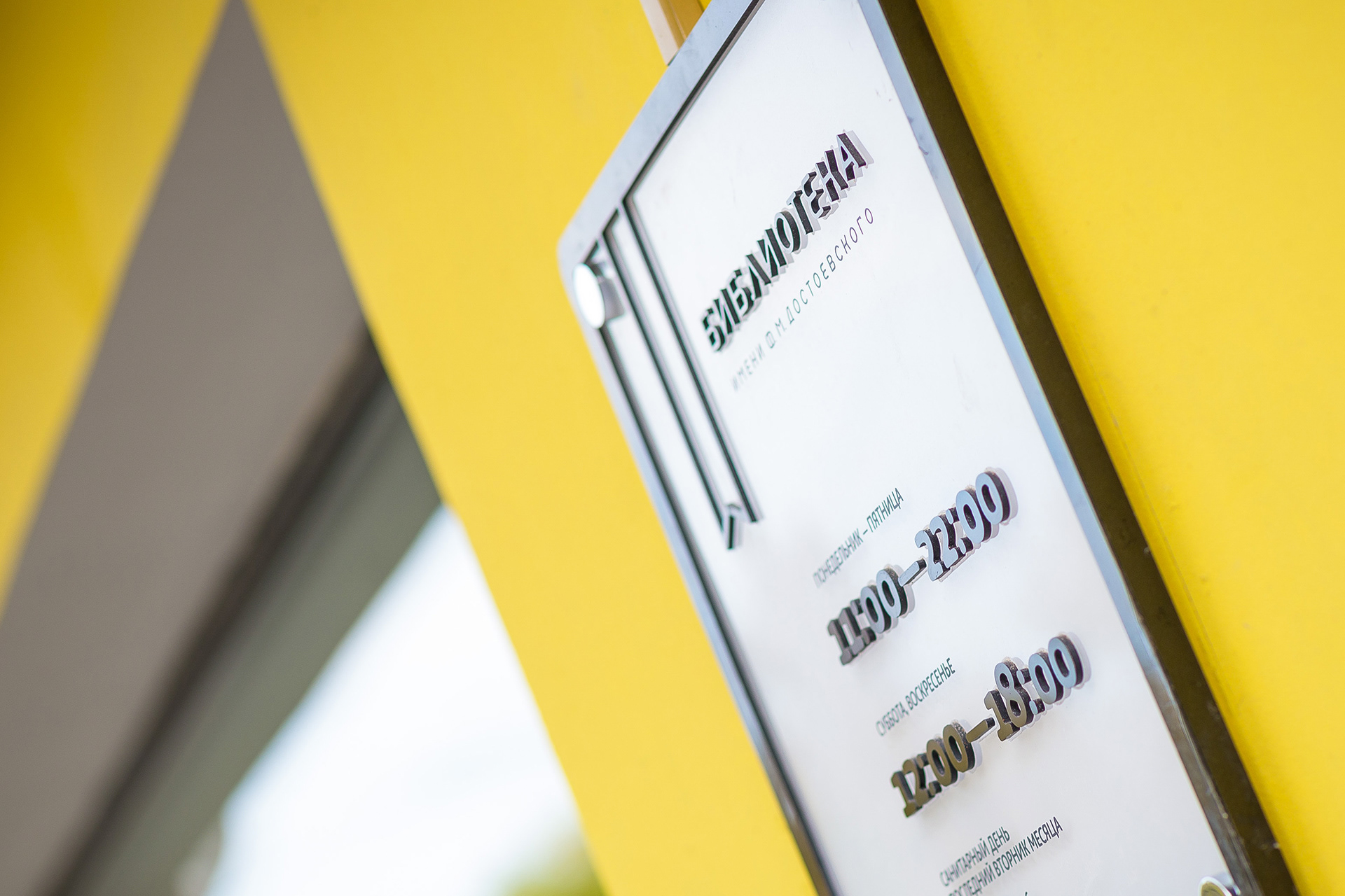
branded timetable plate at the entrance
UNIFORM
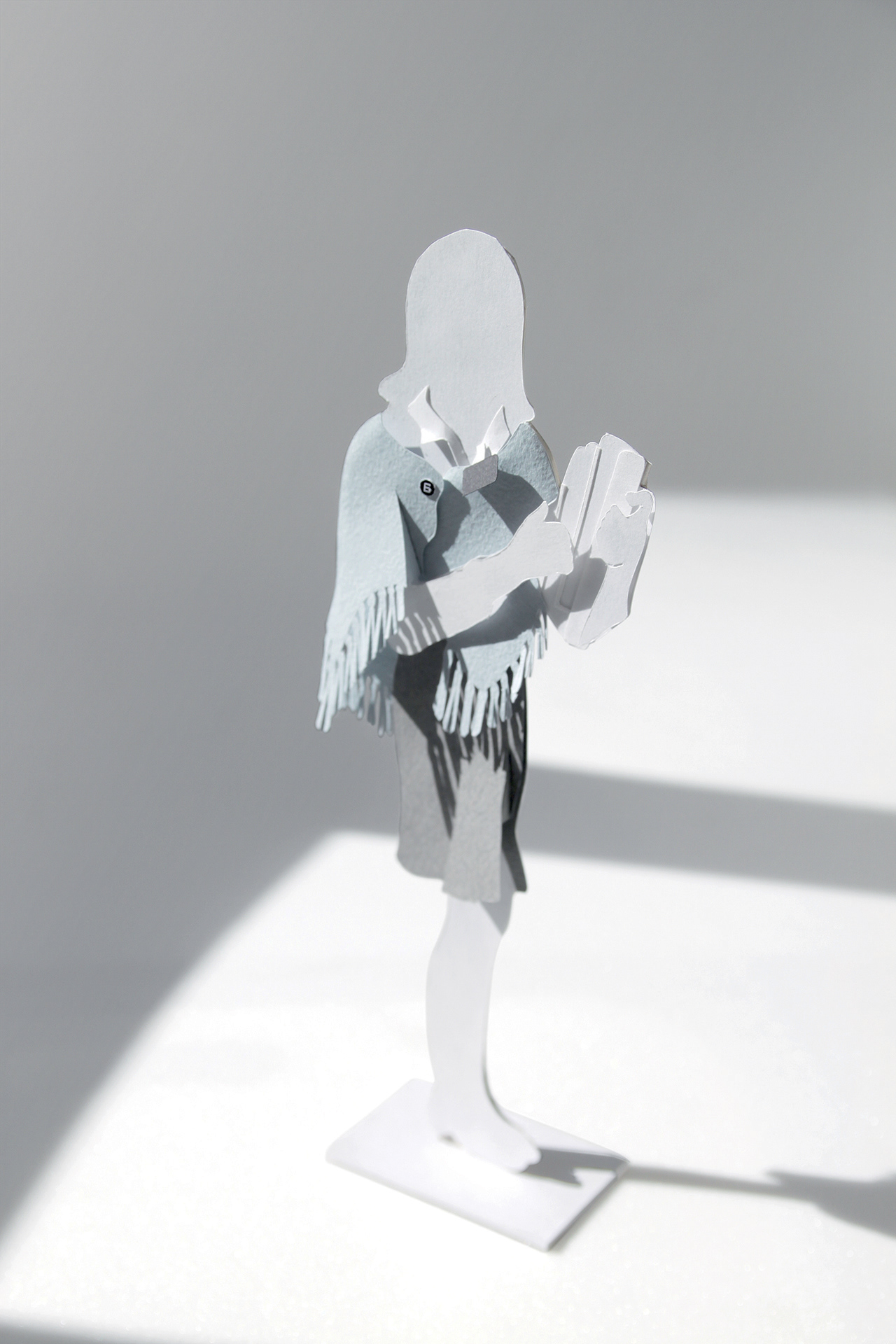
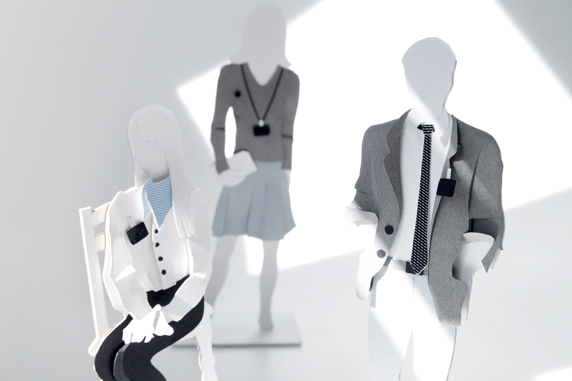
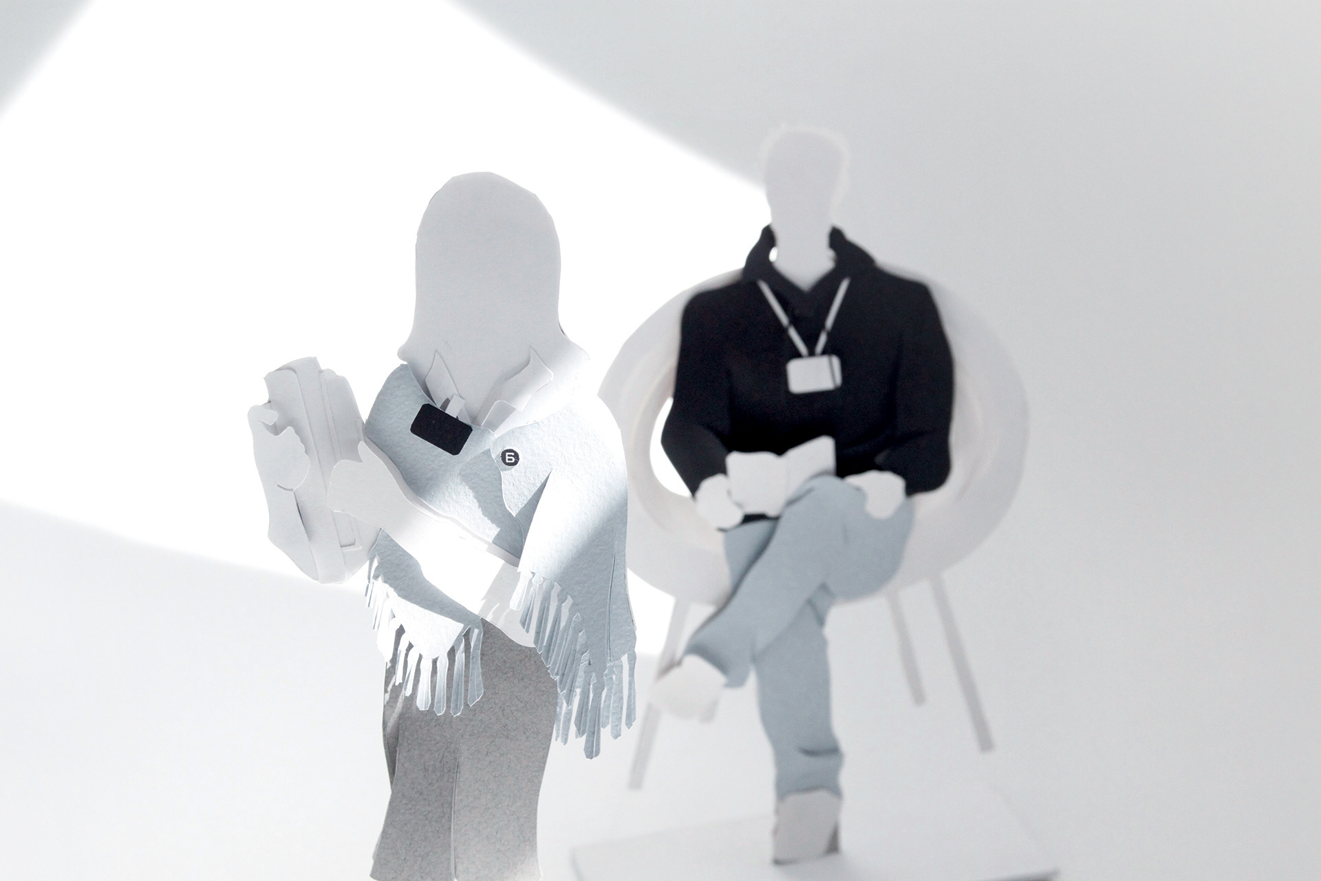
To express our thoughts on uniform we have come up with idea to create a few dummies

DRESS CODE
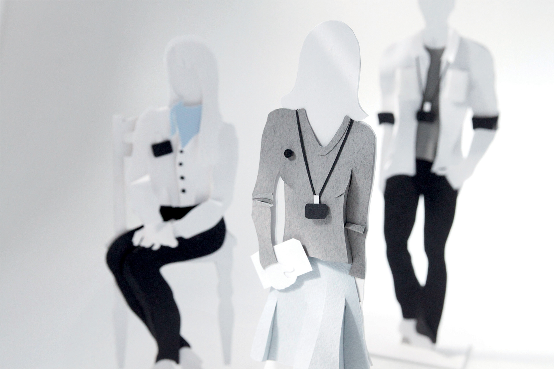
Business Casual Attire is taken as the basis of the branded dress code for a number of reasons. Firstly, it is neutral style, which eliminates the possibility of contradiction with the overall atmosphere and visual identity of any given library. Secondly, it leaves space for further interpretation and adaptation to any library. Thirdly, as it allows certain variations it avoids the rigidity of corporate clothing style. The preferred colorful palette consists of delicate pastel shades.
Business Casual Attire is taken as the basis of the branded dress code for a number of reasons. Firstly, it is neutral style, which eliminates the possibility of contradiction with the overall atmosphere and visual identity of any given library. Secondly, it leaves space for further interpretation and adaptation to any library. Thirdly, as it allows certain variations it avoids the rigidity of corporate clothing style. The preferred colorful palette consists of delicate pastel shades.
However, it is acceptable to wear one or two items of a bright saturated colours as long as its share in the overall look does not exceed 10%. This Brand Book provides a few examples of how various garments and colours could be combined to illustrate the basic principles of the style.
FOOTWEAR
Apart from being appropriate for the occasion/place and comfortable, shoes must not produce too much noise when being worn. Therefore, shoes should be free from noise-producing elements, such as heeltaps, accessories, etc.
Women’s shoes are to be medium-heel with non-metal heeltaps and should not be overloaded with decorative elements.
The same rule applies to men’s footwear.
The same rule applies to men’s footwear.
Use of brand elements in clothing
Branded style is not only defined by the colours of the clothing, but also by the use of (elements) of logo. Librarians are obliged to wear at last one of the branded elements, i. e. garments with a logo on it, and the badges.
Apart from the unisex branded items, such as T-shirts, shirts, badges, oversleeves and pullovers, we suggest specific items for men and women.
Women can choose either shawl or neck scarf. Men are given a choice of branded belt and/or tie.
Librarians are to wear a name badge at all times when at work.
Librarians are to wear a name badge at all times when at work.
UNACCEPTABLE
• Garish clothes.
• Clothes with bright colourful prints and/or large other brand logos and/or names.
• Garments with bright patterns.
• Footwear with metal heeltaps.
• Garish clothes.
• Clothes with bright colourful prints and/or large other brand logos and/or names.
• Garments with bright patterns.
• Footwear with metal heeltaps.

MISCELLANEOUS


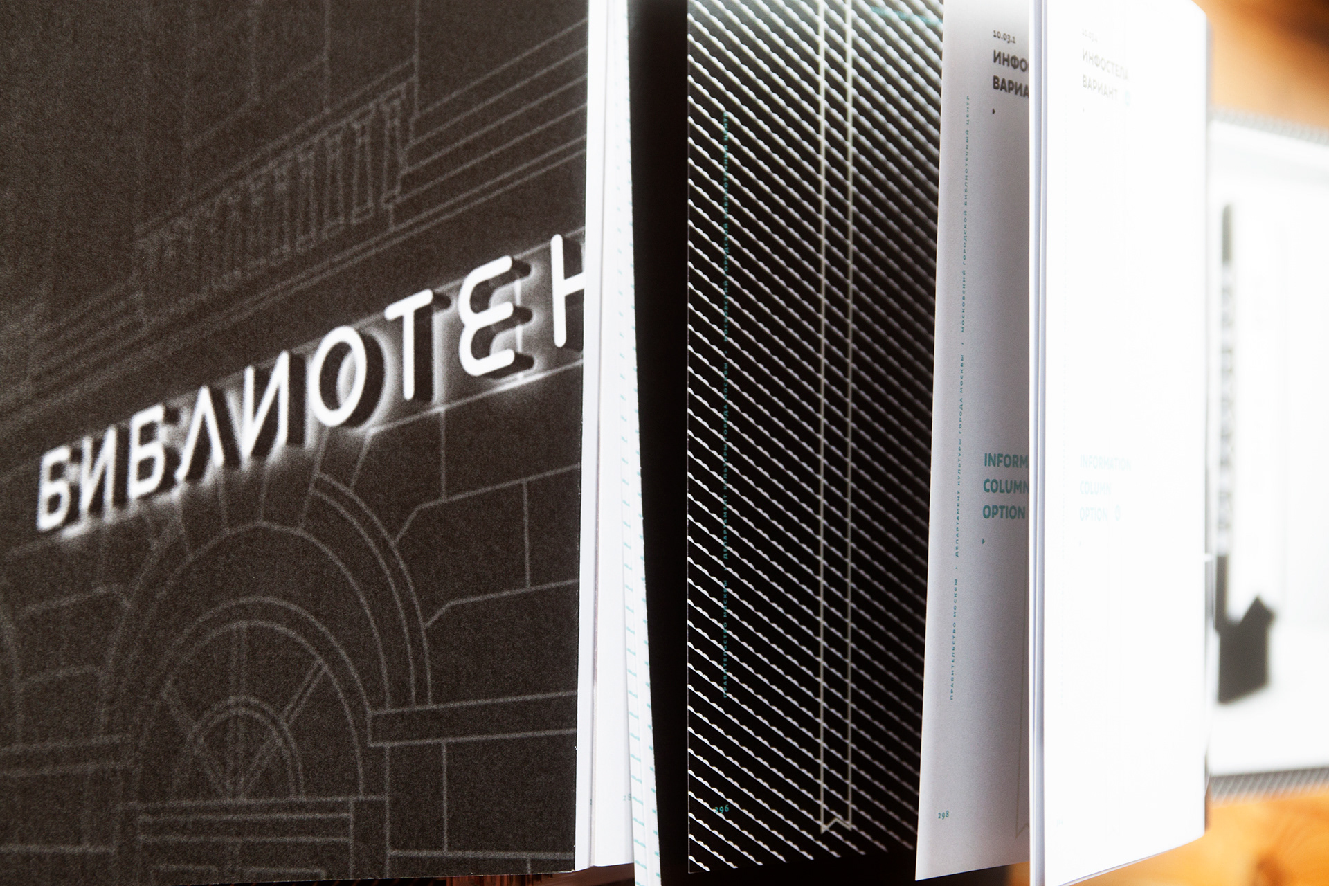
THE BRAND BOOK
THE APPEARENCE
The brand-book consist of a slipcase and a folder. The slipcase face has 30 degree angled cut which reflects main brand element "book-mark" and leaves some room to ease access to the folder. The brand-book body has matte black finishing and the folder spine is marked with brand element "book-mark" brought by glossy selective vanishing.


There is D-shaped four ring holder being used to keep in order 316 pages.


Saatchi & Saatchi Moscow
Руководитель проекта / Creative Director:
Сергей Сидоров / Sergey Sidorov
Клиентский отдел / Accounts:
Даша Сураева, Наталья Куликова, Наталья Сысоева
Стратегический отдел / Strategic Deprt. :
Екатерина Данилюк, Наталья Аметова
Творческая группа / Creative Team:
Сергей Сидоров / Sergey Sidorov, Анастасия Ведерникова / Anastasiia Vedernikova
Влад Боереан / Vlad Boerean,
Техническая поддержка, пре-пресс и верстка / Studio:
Андрей Ивандиков, Вася Гедзун, Виктор Чередников
Продюсеры / Producers:
Мухарам Кабулова
Техническая поддержка, пре-пресс и верстка / Studio:
Андрей Ивандиков, Вася Гедзун, Виктор Чередников
Продюсеры / Producers:
Мухарам Кабулова